
Turn a Photo into a Geometric Swiss-Style Poster
Prompt
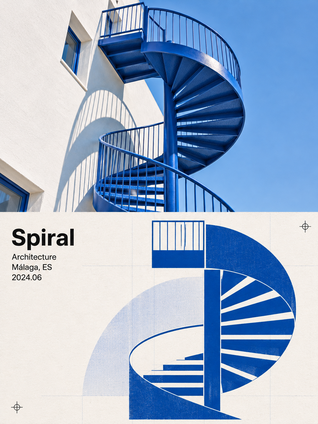
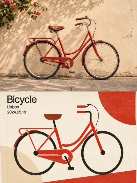
Please turn each photo I upload into its own separate, high-end design poster. Do not combine multiple photos into one image; output a separate poster for each photo. Use an overall 3:4 portrait composition, with the top and bottom sections exactly equal in height, each taking up 50% of the image.

Preserve the original photo in the top half, keeping the subject's identity, structure, pose, realistic texture, natural lighting, and original color atmosphere. Apply only subtle, sophisticated color grading to give it the feel of an art magazine or design archive. You may naturally extend the surrounding background to fit the format, but do not stretch, distort, or alter the subject.

In the bottom half, extract the photo's most recognizable **subject, silhouette, structure, and direction of movement**, and reimagine them using **Swiss International Graphic Design / Swiss International Typographic Style**. Simplify the subject into a small number of geometric elements such as circles, rectangles, arcs, diagonal lines, and bands of color. Make the original subject recognizable through the relationships between the elements' positions, proportions, and directions, keeping the result abstract yet accurate.

Build the composition on a **strict but invisible grid**. Align all geometric elements to the grid lines, while keeping the overall composition asymmetrical and dynamic. You may use bold contrasts in scale (a very large circle paired with an extremely thin line) and strong diagonals to create modernist tension and rhythm.

Emphasize the authentic texture of offset or screen printing: subtle unevenness in the flat color areas, the matte finish and fibers of the paper, and occasional overprinting and registration misalignment. You may let very faint grid guides show through, like a designer's working draft. Avoid digital gradients, 3D rendering, and an overly smooth vector look.

Center the composition on a **rational grid + generous negative space**. Let the geometric subject occupy about 45% of the bottom half; leave the rest as white or monochrome negative space. Treat the negative space as equally important as the graphics to establish a clear visual hierarchy.

Draw 2–3 of the most recognizable colors from the photo above and combine them with black and white to create a highly restrained, clearly contrasted Swiss-style color scheme. Keep it clean and bright, not dull or muddy.

Use a small amount of text, arranging 2–4 lines of information in small, left-aligned sans-serif type (with the feel of Akzidenz or Helvetica): a word, a place, a date, or a short line. Align it precisely to the grid to create a rational dialogue between text and graphics. Any language is acceptable.

The overall visual should combine a **strict grid, asymmetrical geometry, flat printed colors, sans-serif information, and generous negative space** to create a modernist design. The core principle is: let order express the emotion in the photo. Avoid decorative elements, digital gradients, crowded layouts, cheap flat illustration, a cartoon feel, and template-like posters.
Input images
Summary
Attach a photo to create a poster with the original photo in the top half and Swiss International Style graphics in the bottom half. Reinterpret the subject as circles, lines, and areas of color, using an asymmetrical composition, negative space, and the textures of paper and print for a modern look.