
Prompt to convert travel street photos into photographic × hand-torn paper art edit posters
Prompt
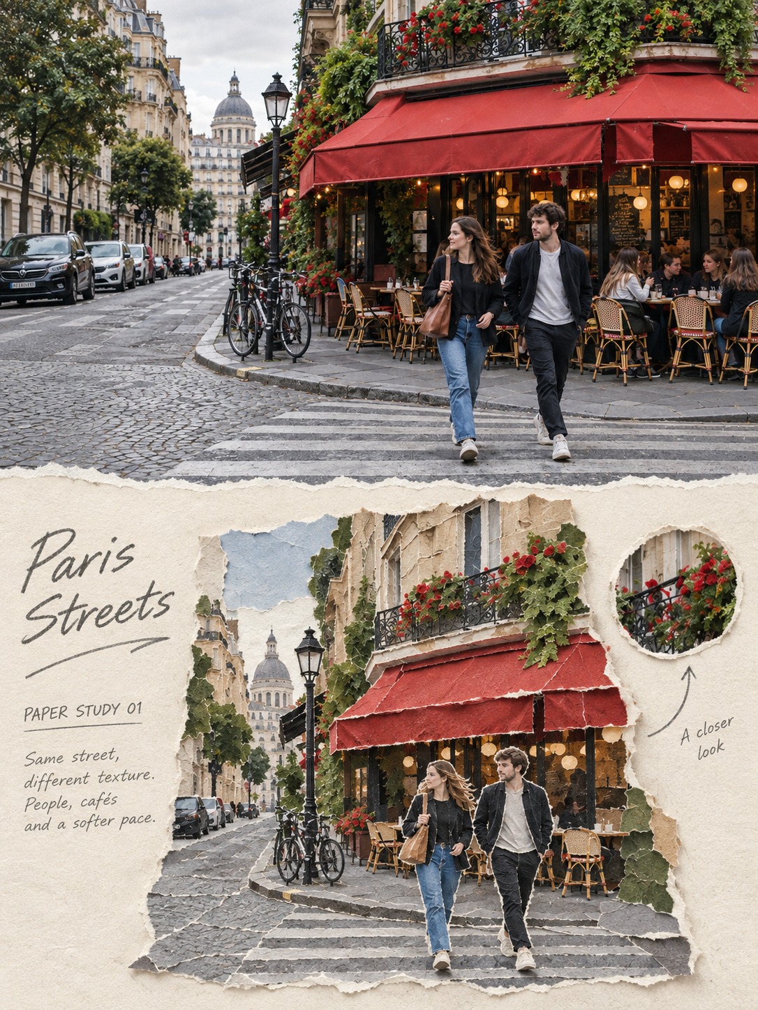
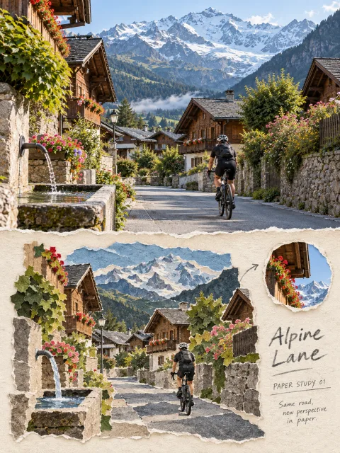
Please make each travel street photo I upload into a separate, standalone high-end torn-paper art edit poster — one poster per photo, no multi-photo collages. Use a vertical 3:4 diptych composition: keep the real original photo clearly visible in the upper panel and reconstruct the same street in the lower panel as a “torn-paper street reconstruction.” The top and bottom areas should be close to a 1:1 height ratio, separated by a clear, horizontal boundary. Do not fog, blend, or let the two areas bleed into each other. Output only the front of the poster — do not generate frames, walls, or handheld mockups.

Upper half should occupy about 47%–50% of the frame and faithfully preserve the original photograph. Precisely maintain the street’s viewing angle, vanishing direction, road slope, the buildings on both sides, eaves, doors and windows, signs, vehicles, plants, power lines, number and poses of people, and the original natural light, shadows, and color atmosphere. Apply only subtle travel-magazine style color grading and a very light film grain so the result remains clearly photographic. To fit the aspect ratio you may naturally extend sky, pavement, or quiet background areas, but do not redraw buildings, move people, alter vehicles, stretch, mirror, or duplicate subjects.

For the lower half do not simply apply a paper filter to the same framing of the original or use rectangular photo-fragment collages. First select from the photo the main street vanishing line, the primary façades on both sides, and one to three objects that most define the place (for example: pedestrians, vehicles, lanterns, umbrellas, power lines, plants, signs, or rooftops). Actively remove repeated window panes, complex crowds, irrelevant small items, and photographic noise. Reorganize these elements into a reduced, clearly contoured, physical torn-paper scene.

The redrawn scene should occupy about 60%–82% of the lower area, and can be centered or slightly off-center. Leave approximately 20%–35% continuous ivory paper margin around it. Rescale and re-prioritize visual hierarchy based on the original photo so the most recognizable building, object, or person becomes the paper anchor — do not copy the photo’s full composition. You may add a small torn-paper circular window in the blank margin that magnifies a real detail from the original and connect it to the main scene with a single graphite arrow.

Use hand-torn matte fiber paper, thin xuan (rice) paper, corrugated cardboard, kraft paper, and a small amount of old printed paper, assembled piece by piece to build volumes, road surfaces, eaves, plants, sky, and figures. All principal shapes must show clearly visible torn-fiber edges, slight overlaps, paper thickness, lifted corners, and short, natural cast shadows. Paper edges may be irregular, but the street’s outer silhouette, road direction, building boundaries, and subject identities must remain legible. Smooth vector cuts, laser-cut edges, and flat digital shadows are prohibited.

Derive the color palette entirely from the top photograph. Reduce complex colors to five to seven desaturated/grayish paper tones, using the real main colors of walls, pavement, roofs, plants, and people as the skeleton. Retain only one accent color — e.g., rust red, cobalt blue, olive green, or another distinctive color from the original — as emphasis. Do not apply a fixed “Japanese travel” palette to every location.

On the continuous bare paper area add a set of pencil captions. From details verifiable in the photo (place, road structure, light, weather, or action) extract a 1–3 word English title; include the field "PAPER STUDY 01" (number multiple photos sequentially); then add one observation sentence of 5–12 English words. The title must be legible in normal chat preview; the field and observation sentence should be smaller but not reduced to a faint gray line. The handwriting should look like fine graphite or charcoal drawn directly on the paper; you may include one arrow. Do not use smooth digital typefaces. If the exact location cannot be confirmed, use a scene-themed title — do not invent place names, dates, or coordinates.

Overall the page should sit between architectural observation, material study, and travel publishing: the street should be instantly recognizable, paper layers feel real, boundaries are clear, information is edited down, and there is sufficient white space to breathe.

Avoid notebook nine-grid layouts, rectangular photo collages, identical composition paper filters, fully filled backgrounds, child-like cut-and-paste collages, generic travel icons, fictional landmarks, author names, account handles, logos, QR codes, watermarks, fake Chinese, or garbled text.
Input images
Summary
Send this prompt together with the photo(s) you want to convert