
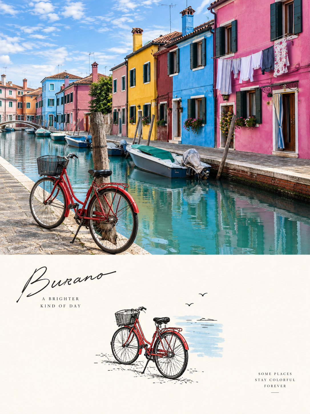
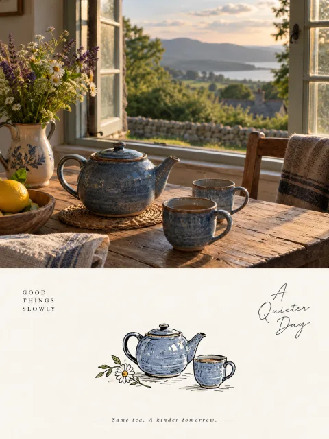
Prompt to transform photos into hand-drawn spot-illustration posters with beautiful negative space
Prompt
Please convert each photo I upload into an independent, high-end design poster, one photo per output—no multi-image collages. Use a 3:4 vertical composition overall, with the upper and lower areas strictly 1:1 in height, each occupying 50% of the frame.

Keep the top half as the original photograph, preserving the subject's identity, structure, pose, real texture, natural light and original color atmosphere, applying only subtle high-end color grading so it acquires the texture of an art magazine, independent publication, or exhibition image. To fit the frame you may naturally extend the environmental background, but do not stretch, distort, or alter the subject.

For the bottom half, first understand the photo's most memorable core subject, the relationships between subjects, compositional flow, and visual memory points; then reconstruct it as a large-negative-space Spot Illustration / small negative-space graphic illustration. Do not copy every object from the photo or fully redraw the scene; instead remove irrelevant details and retain only the contours, gestures, proportions and identifying features that best represent the original, summarizing them into a restrained-sized, independently existing small graphic so viewers can immediately recognize its correspondence with the photo above.

Composition should adopt a single-point visual logic: a small central graphic plus large areas of negative space. The subject should occupy only a small proportion of the bottom half, placed centered or slightly off-center, leaving abundant clean white space around; the white space is not merely empty background but an important element that, together with the subject, creates a sense of breathing, spatiality and preciousness. The image should not be filled, should not stack complex elements, and should not include a full background—only a clear and quiet visual focal point.

Graphic language: minimal hand-drawn sticker-like small illustration. The subject may be constructed with black hand-drawn linework, white or light solid shapes and a few simple forms, with a clear outline, slight hand-drawn warmth and mild irregularity—like a carefully placed small sticker-like spot graphic. Whether the subject is a person, building, animal, plant, object or landscape, extract only its "soul-like" core features; do not pursue realism, complex perspective, or finely detailed fragments.

Color logic: achromatic-dominant + a single accent color. Use white, off-white or warm light white as the base, with black or dark gray hand-drawn lines and structural elements, and extract only a very small amount of the most tasteful single light color from the top photo as an accent. Prefer converting it to a high-value, low-to-mid-saturation pale ice blue, sky blue, etc., or flexibly replace with similarly light tones depending on the original image, but always apply it only in very small areas—never spread it evenly. Maintain a restrained, light, clean, cute and refined overall look; avoid high saturation, multiple colors side-by-side, large color blocks, or a dull dirty-gray appearance.

Text should be only minimal editorial intervention and may be in any language. You may freely extract a few words or short phrases based on the subject, location, action or mood, and quietly place them at the edge of the negative space to form a simple typographic relationship with the graphic; do not add menu-style information or let text overpower the visual.

Overall presentation: a high-end visual effect composed of a small graphic, large negative space, black-and-white dominance, a single pale-color emphasis, hand-drawn sticker feeling and restrained typography. Avoid direct object redrawing, complex backgrounds, filling the frame, multiple subjects side-by-side, even color usage, cartoonish piling, cheap sticker aesthetics, and templated poster looks.
Input images
Summary
Creates 3:4 posters that keep the top half as a photographic real-image and place only the most striking subject as a small hand-drawn sticker-style illustration in the bottom half. Upload photos containing people, architecture, animals, plants, objects, etc., and input the original text as-is. There are no replacement slots. The result is an editorial design with beautiful negative space, mainly black-and-white with a subtle accent color.