
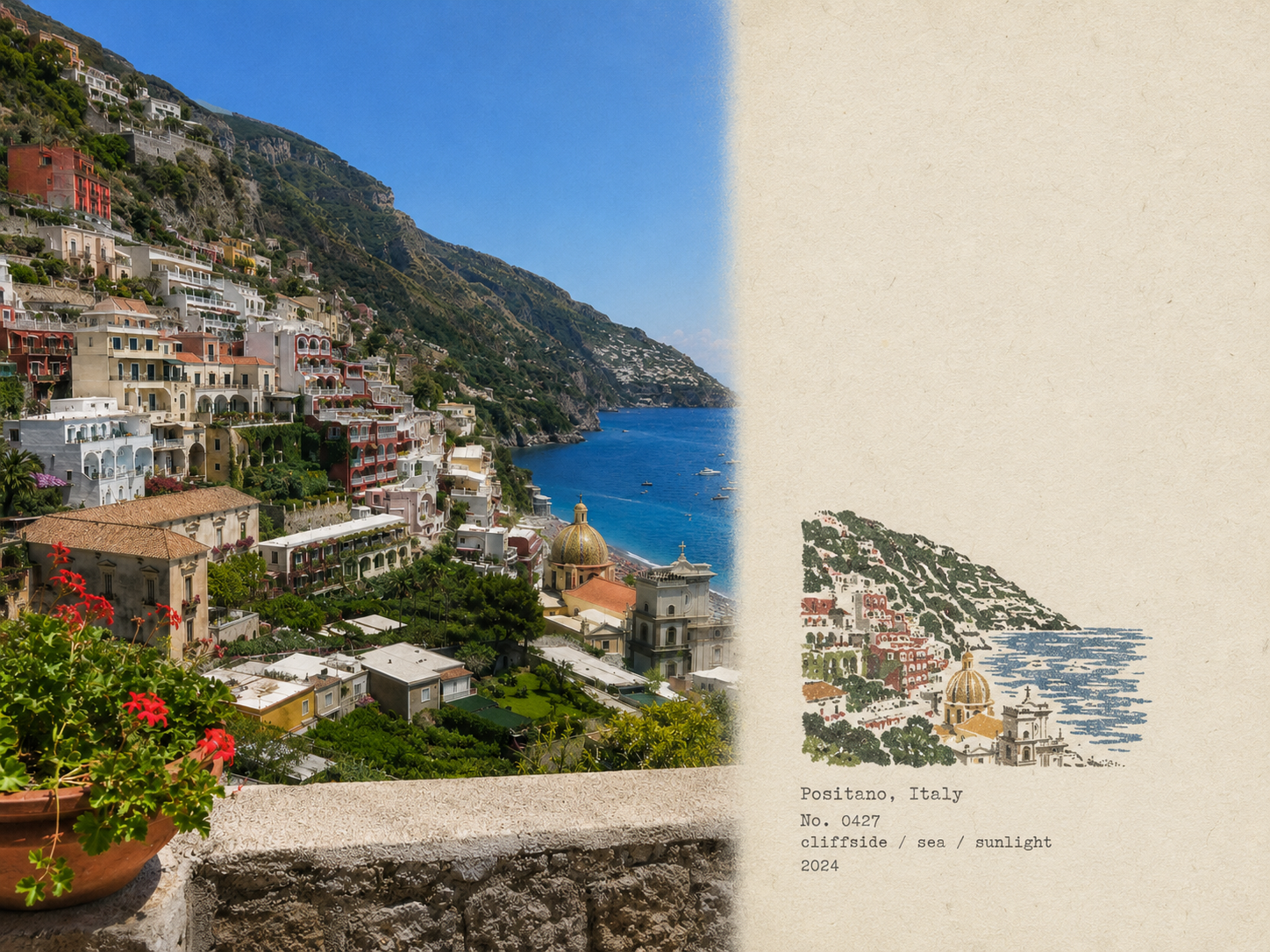
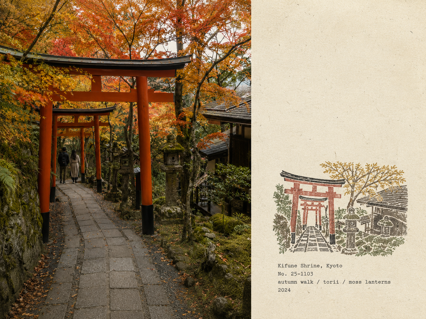

Prompt to Turn Travel Photos into Multicolor Rubber-Stamp Field Notes
Prompt
Please convert each photo I upload into an individual “rubber-stamp travel field notes poster.” Output one poster per photo; do not create multi-photo collages.

Overall use a 4:3 landscape composition, dividing the frame into left and right regions, but do not draw an obvious dividing line.

Left side should occupy about 58% of the frame and faithfully preserve the original photo. Accurately retain subject identity, terrain, buildings, plants, people, spatial relationships, natural light and shadow, real textures, and the original color atmosphere. Apply only restrained, publication-grade photographic color grading and add an extremely subtle delicate film grain. You may crop naturally to fit the layout, but do not stretch, distort, move, replace, or redraw the subject.

Right side should occupy about 42% of the frame and use a warm off-white aged-paper background. The paper should show fine fibers, natural grain, slight signs of use, and a matte feel, while retaining large areas of unprinted paper white—letting the blank space become an important part of the layout.

Analyze the original photo and extract the most location-recognizable subject outlines, building structures, terrain flow, plant postures, roads, shorelines, or other key visual relationships, compressing them into a small multicolor rubber-stamp image.

Do not copy every detail from the photo. Keep only the minimal information necessary for instant recognition of the original place, subject, and scene relationships. Remove crowds, vehicles, dense windows, repetitive buildings, fine vegetation, decorative elements, and irrelevant background.

The stamp impression should be located in the middle-lower part of the right paper area and overall occupy about 30%—38% of the right-side height, with generous surrounding whitespace. The stamp must not be enlarged into a regular illustration, a complete landscape painting, or a brand logo.

Decide the organization of the stamp based on the original composition:

- Iconic buildings: retain the most identifiable outer contour, roofs, domes, arches, towers, or main structure.
- Mountain settlements: compress buildings into a few terraced color blocks arranged along the terrain.
- Coastal scenery: retain mountain mass flow, settlement tiers, the shoreline, and a few intermittent water textures.
- City distant view: retain the main skyline, one iconic building, and one or two layers of distant hills.
- Natural landscape: retain the main mountain masses, trees, shorelines, or the directional relationship of roads.
- Foreground occluders: if narratively important in the original image, retain them as foreground stamp outlines.

Extract 2–4 spot colors (special inks) from the original photo. Prefer desaturated colors such as charcoal black, deep green, brick red, ochre, gray-blue, gray-brown, etc., but do not force a fixed palette. Preserve the photo’s most recognizable color character, and allow only one small-area color to serve as a visual accent.

Each color layer must appear as a separately hand-stamped effect:

Real rubber-stamp carving texture, hand-carving marks, uneven hatch line thickness, contour gaps, broken edges, dry-ink voids, paper show-through, granular ink texture, uneven pressure, local double impressions, and a slight registration shift of about 1–2 mm.

Allow natural misalignment between color layers; edges must not be digitally smoothed. The impressions should look like genuinely carved stamps pressed onto aged paper, not like a filter-applied photo, a smooth vector illustration, or a line-art logo.

Generate text based on the photo’s place, subject, and visual imagery:

Place name (English)
No. number
Three short English keywords
Year (AD)

Place the text below the stamp or in the adjacent white space, using a small, restrained typewriter font with slight mechanical imperfections. The layout should resemble a traveler’s field notes, not an advertisement headline. Ensure all spelling is accurate; do not add unrelated slogans, brand names, or decorative copy.

The overall temperament should feel like field notes kept by an architect, travel writer, or naturalist: quiet, restrained, tactile, region-specific, with handcrafted imperfections and a collectible sensibility. The photo records the scene; the stamp preserves the most recognizable parts of the memory.

Avoid: obvious central dividing lines, circular seals, Chinese red seals, postage-stamp perforations, wax seals, sticker collages, souvenir-template layouts, smooth vector logos, generic city icons, complete replication of all buildings, dense rendering, childish craft appearance, cartoon style, 3D rendering, plastic textures, smooth digital gradients, oversaturation, excessive text, decorative clutter, and redrawing or altering the left original photo.
Input images
Summary
Create a field-notes-style poster that leaves the travel photo on the left and adds a small multicolor rubber-stamp depiction of the local landscape on the right.