
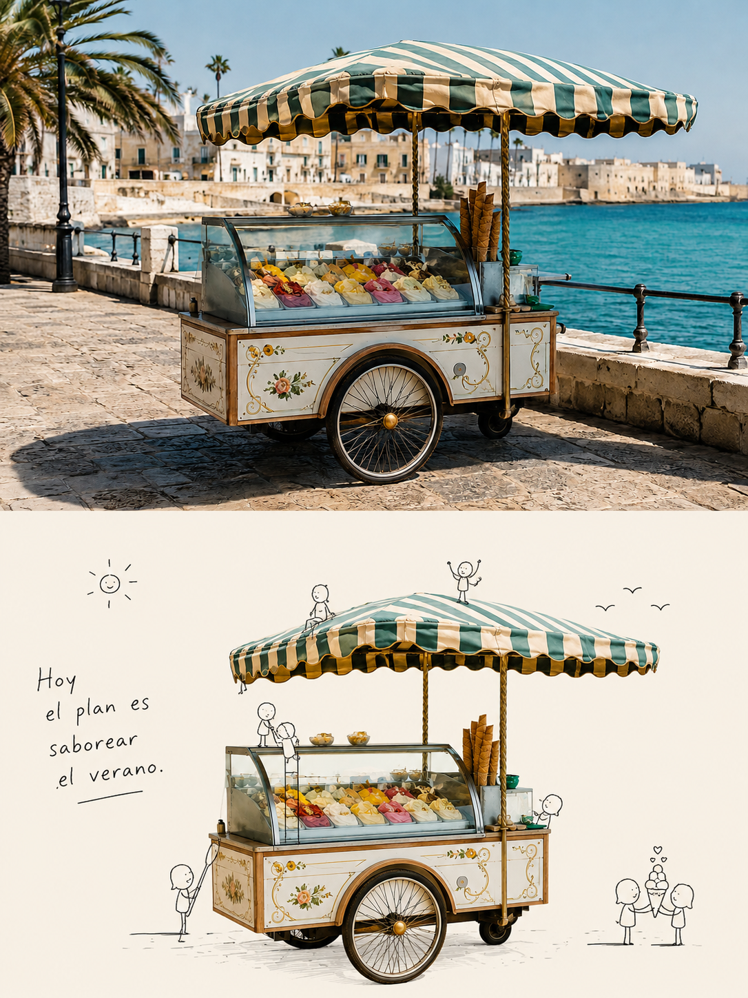
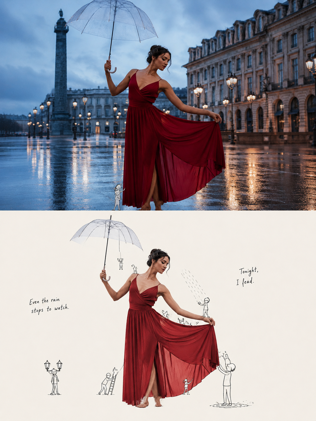
Poster depicting a photograph's story with small line-drawn characters
Prompt
Convert each of the photographs I upload into a standalone high-end editorial design poster. Do not combine multiple photographs into a single composition: each photograph must generate an independent image.

Use a vertical 3:4 composition, strictly divided into two zones of equal height, with an exact proportion of 1:1: the top part occupies 50% of the image and the bottom part the other 50%.

TOP PART

Keep the original photograph, preserving the subject's structure, its realistic texture, natural lighting and the original color atmosphere.

Apply only a subtle and sophisticated color correction, with an aesthetic fitting a lifestyle magazine, an independent publication and art photography.

If it's necessary to adapt the photograph to the format, you may naturally extend the environment or the background, but you must never stretch, deform or modify the main subject.

BOTTOM PART

First understand what is the true visual core and meaning of the original photograph.

Do not limit yourself to identifying “what objects appear”, but ask yourself:

“What is it that truly deserves to be remembered from this image?”

It can be a subject, an action, a relationship between elements, a contrast, an emotional instant or some symbolic meaning.

From that interpretation, extract the most recognizable elements of the subject, its silhouette, posture, spatial relationships and narrative cues, and reconstruct the scene as a playful editorial poster composed of:

“real subject + small characters drawn with black lines”.

Do not mechanically select the largest object in the photograph.

Keep the visual anchor that best represents the spirit, story and personality of the image.

The bottom part must allow immediate recognition of its relationship with the original photograph, while at the same time feeling like an intelligent reinterpretation of it.

The real subject must retain its materials, texture and identity.

You may slightly optimize the angle, proportions, lighting and color to better highlight its essential characteristics.

Elements of the original photograph that do not contribute to the meaning may be removed, but those visual relationships that are fundamental to understanding the subject must be preserved.

Around the subject incorporate a small number of tiny characters drawn with minimalist black lines.

The actions, positions and interactions of these characters must be generated naturally from the shape, context and possible meaning of the original photograph.

The small characters should appear to be responding to, amplifying, commenting on or even contradicting the original photograph's story.

They should not perform random actions solely to be cute.

COLOR

Extract from the top photograph the colors with the most personality and recognizability.

You may refine them, slightly increase their luminosity and reorganize them to achieve a clearer composition.

The background should be primarily cream-white, a light tone or one of the most pleasant light colors present in the original photograph.

Keep a large amount of negative space.

The real subject should provide most of the color, while the small characters and texts should use thin black or dark gray lines to generate contrast.

The overall aesthetic should feel clean, light, restrained and sophisticated.

TEXT

The text should also arise naturally from the central meaning, emotion and visual relationships present in the original photograph.

It should not be limited to naming the objects in the image nor use predetermined phrases.

Transform what truly deserves to be remembered from the photograph into an extremely brief, light, clever phrase with a small touch of humor, irony or double meaning.

The text should feel like an annotation made by the small characters, a thought or a line spoken off-camera.

It can be freely distributed following the contour of the subject, the movements of the characters or the rhythm of the negative space.

The text, the characters and the subject should build the narrative together.

It should not seem like a title added later onto the image.

GENERAL STYLE

Maintain a balance between:

— the real subject,
— the essential meaning of the photograph,
— the micro-narrative,
— the deliberately naive lines of the characters,
— and a large amount of negative space.

Regardless of whether the original photograph shows people, animals, plants, food, architecture, objects, vehicles or natural landscapes, first you must understand:

“What is this photograph really about?”

Only then decide how to reconstruct it.

Avoid:

— focusing only on the objects while ignoring their relationships,
— creating cute interactions without a theme or meaning,
— a sticker/cartoon sticker aesthetic,
— overly complex decorations,
— and any sense of repetitive template.
Input images
Summary
Create a poster that leaves the top half of the photo as a photograph and combines the photo's main subject with small line-drawn figures in the bottom half.